I've selected these sites based on a few criteria such as website design, overall user experience, eCommerce best practices, core strategies to increase AOV/CLTV such as subscriptions, loyalty/referral programs, as well as just looking mighty fine.
In terms of the this guide, I've shared some of the key highlights of their homepages which I think there are good learnings. In addition to what I've shared, I encourage you to check out their other pages to get even more learnings.
So, whether you run a successful coffee shop in your local area, need some design inspiration, or simply want to see what the best coffee shop website is, then I'm hoping you will enjoy this guide I put together.

Spinn is a coffeemaker brand that was born in 2016 through a crowdfunding campaign, and by 2021, it has raised more than $40 million dollars in venture capital. The company sells coffee makers that brew your coffee in less than 60 seconds. Think of those pod machines, except this one uses actual coffee beans.
Sure, it’s significantly more expensive than those machines at an average price of $1,000 per Spinn coffee maker, but it’s freshly brewed coffee at home. In an instant. Plus, they just launched the Spinn App, which syncs with your machine and would brew coffee for you – by voice command.
If you’re not convinced, check out their website. Here are the things I like about it:
ANYONE would want $100 off, and this is a great offer to get people to sign up for their email list.

Who doesn’t want perfect coffee made easy? This speaks to the market of the product, which are coffee lovers who spend hours trying to achieve the perfect blend.
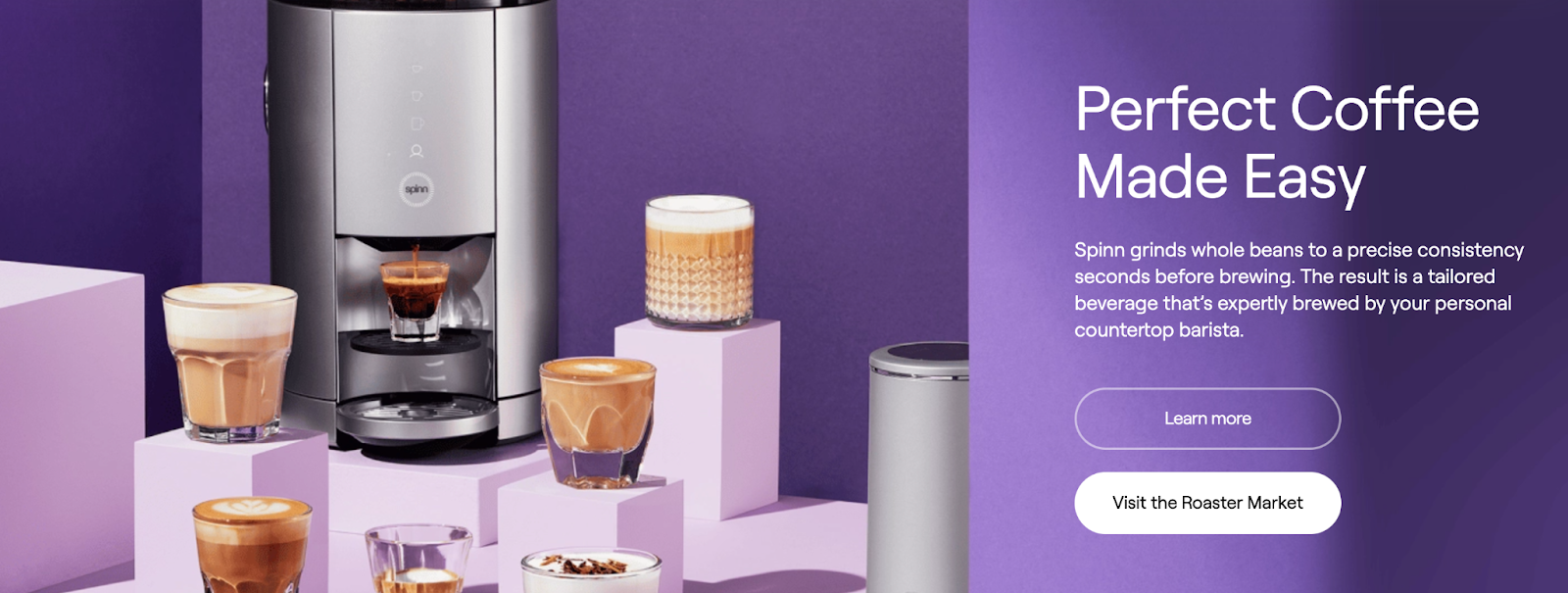
$999 may seem steep for a lot of people, so it’s great that the website highlighted how people could just pay in installments.


A beverage company based in NYC, Drink Okana calls itself “the ultimate coffee alternative.” Its whole concept is based on the idea that while coffee is a great drink, it also comes with side effects such as jitters, gut ache, and energy crashes. So, the company came out with a drink just like coffee – except without the needless consequences on our body and environment.
Their website does a great job of letting us know exactly what the product is:
It’s a great tagline, which then makes the audience curious to know about it.

This lets the audience ponder on the negative side effects of coffee, thus putting Okana in a positive light and making people want to give it a try.

There is also a redirect link to their instagram stories, which would help bridge the lead to social media connections.


Touchy Coffee is a coffee roaster in New York and was founded in 2018. They are the sister company of Superior Merchandise Company, which is a design shop and specialty coffee bar located around the same area.
The goal of the company is this: to highlight the coffee being made by different communities around the world. So, they mindfully source coffee that are carefully and meaningfully created by artisans around the world.
They properly share their story and offers through their website, which is very artistic and unique in it design:
This subconsciously wires the brain of the site visitor to purchase above $50 so that they can make the most of their cart.

It’s worth noting that they included in the product titles the countries where the coffee is sourced from, thereby giving the audience a feeling of being coffee connoisseurs.

This makes things more personal for the audience, and appeals to their need for connection beyond the commercial.


Verve Coffee is a famous coffee roasting company that has been in the business for 15 years. It currently has 24 branches across America and 4 branches in Japan, and has been named as one of the top coffee companies in the country by Food Republic and Thrillist.
The heart of the company is to honour the craft of coffee, whether that’s at the farm level or the store level. They do this through their direct-trade buying model and setting up artisanal, slow cafes where communities can come together.
Here are the things I like about their homepage:
One would wonder, what does Honey Lavender Oatmeal Latter taste like? Given the corresponding promotion, those who are curious enough would then check out the product.

This lets the audience know the options available to them and provides them with easy access to what they may be looking for.

I think this is really cool. This makes newbies to coffee feel less intimidated to make a purchase and provides options to those who want to explore something new.


The Good Ritual is a company founded by Australian sisters who love coffee and grew around it, yet have come to dislike the jitters that come with it. Hence, they worked to formulate what is known as the first ever specialty instant coffee, which is said to taste exactly the same as what you could get from baristas.
Their product is infused with L-Theanine, an amino acid that is said to reduce symptoms of anxiety and promote relaxation, thus balancing if not negating the pulpating effects of coffee.
Their website maps out exactly what they’re all about:
What I particularly like about this email sign-up offer is that it also clarifies what the product is and what makes it special. This is great for visitors who are discovering the brand for the first time.

Because it is phrased like something a peer would say, it translates better to the audience.

This balances out the casual language we see above, and establishes the legitimacy of the product.


OneBy Coffee was founded by an adventurous man named Tim, who claims to have spent years trying to look for the perfect coffee, yet he couldn’t find it. So he created it himself. He calls OneBy “a super concentrated artisanal coffee” that is cost and time efficient, and the best part is you’re guaranteed the flavor and experience each time.
The company website perfectly props up the product in this sense:
The line “Cafe-quality coffee in seconds” is great, and the fact that this is followed by “long lines and $6 lattes” serves as a reminder people should skip cafes in the first place.

This also shows how customisable the coffee can be, which would be appealing for those who prefer to make their own blends.

Given the nature of the product, it’s great that the website has tried and tested mixes that customers can try. This would make the product less daunting for them.


You may have already seen Cometeer somewhere online, as the flash-frozen coffee brand has been making waves as the next big thing in the industry. Founded and developed by a team of MIT chemists and engineers in Massachusetts, the company makes their pods by brewing coffee to 10 times its strength, flash-freezing them, and then sealing them for later melting at home.
It’s basically like coffee in a pod, except with recyclable aluminium cases and without the need for machines. Of course, you have to remember to keep them in the freezer for optimal freshness.
Their website excellently provides more information:
I’m not entirely sure about their headline “A new day has arrived on earth for coffee” because it doesn’t clearly convey anything about the product or the brand, but I do like the line after it which says “Incredibly delicious coffee made impossibly convenient. The second line seems to capture the unique selling point of the product than the headline.

The fact that they used different-coloured coffee pods for each logo and brand is genius, and it definitely catches the eye of anyone scrolling through.

When you hover over each box, the video on the left will change accordingly. So, if you choose iced latte, you don’t just refer to the graphic shown in the boxes. There will also be a corresponding video that shows you how it’s done.


Sightglass Coffee was created in 2009 by two siblings in San Francisco, and each year, they travel to East Africa, Central America, South America, and the Pacific Islands to ensure that they are able to source the best of the best and to maintain a close relationship with the farmers and communities they work with.
Accordingly, the heart behind the brand is to make each coffee drinker more mindful about where each cup of their favourite drink comes from. They’re all about sourcing green coffee and upholding quality and integrity through the process of sourcing, roasting, and distribution.
And they’re not just awesome as a company; they also have a great website:
They most likely highlight different coffee made by various communities after every couple of months, which shows just how committed they are to their mission as a brand.

I think it would have been better if they added the full address of these locations, but regardless, this issues a very simple call to action to the customers.

It’s especially great (and again, true to the brand) that they highlighted not just the countries where the coffee came from, but they also named the coffee after the cooperatives, families, and local businesses that had a hand in it.


Founded in 2014 by veterans of the armed forces of the United States, one can say that Black Rifle Coffee was so aptly named. 40% of their employees are also former members of the armed forces, and their goal is to eventually hire 10,000 veterans and provide more opportunities to the military community.
The company is based in Salt Lake City, Utah, though they have since expanded to Canada and have their merchandise and products available at over 1,700 retail stores across America. Their website does a really good job at showcasing their products and what they stand for:
The call to “Support the troops” is eye catching, and the idea that for every customer that buys a bag, they’ll give a bag to those serving the country will appeal to the generous heart of their audience.

This is great for those who may feel overwhelmed from all the choices. This way, they can view only those that fit their taste.

The “join over 1 million followers now” is a very effective call to action phrase, and a quick redirect link to their account will cause more people to convert.

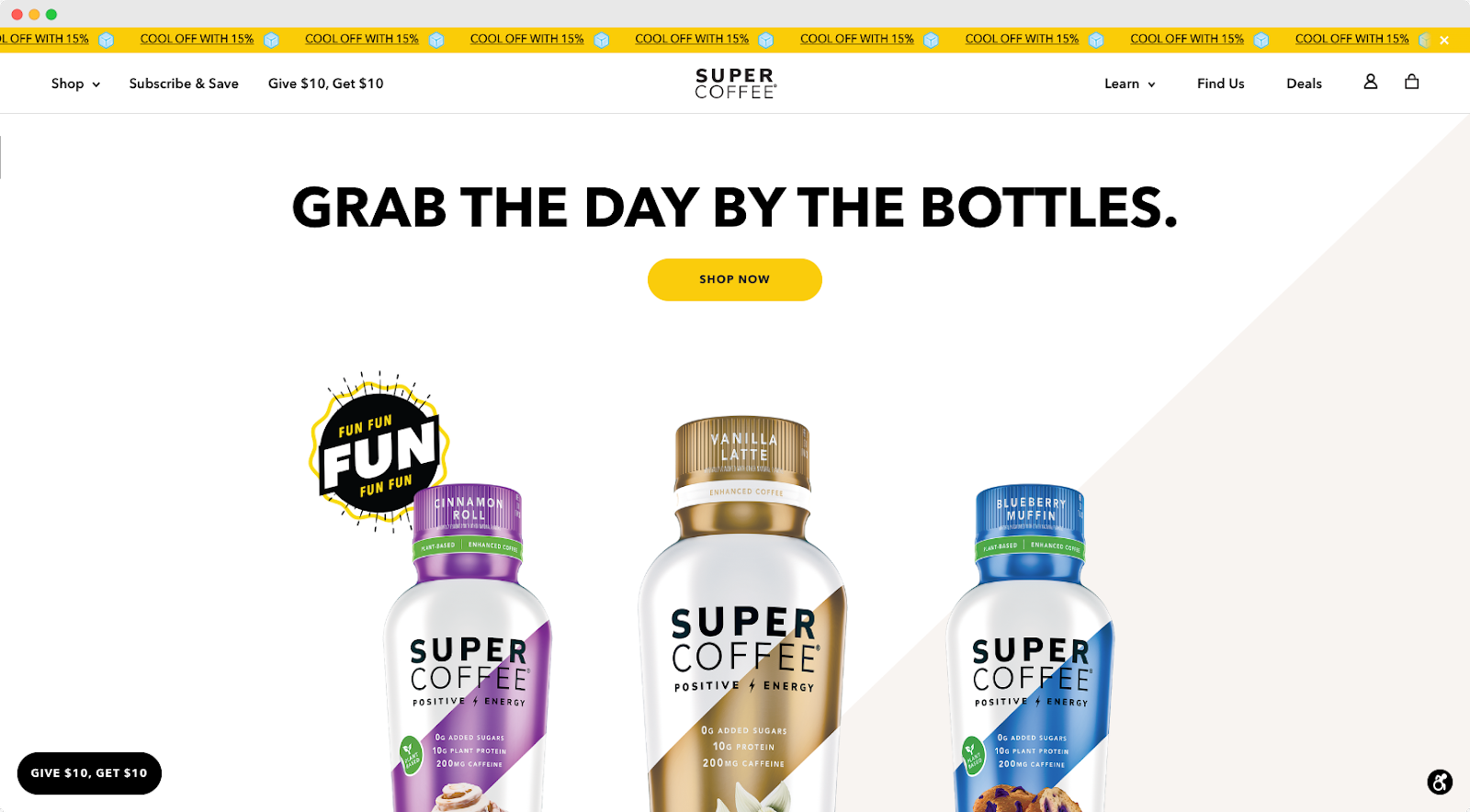
Super Coffee may very well be the coffee for celebrities, as Jennifer Lopez, Kristin Bell, Aaron Rodgers, and a dozen other celebrities and public figures have given it praise. Though that’s not really a surprise, as investors like Alex Rodriguez and Arnold Schwarzenneger have a stake in it. The company has since been named as the fastest growing food and beverage brand by America by Inc Magazine – and for good reason.
The brand produces plant-based canned coffee, and they claim to use ingredients that are healthy, great-tasting, and energising. This is conveyed quite clearly on their website:
The copy, “Grab the day by the bottles” is witty and catchy, and it’s great that this is followed by images of the products in bottles, with their different flavour tags.

This allows people to know that regardless of their preferences, there is something for them with Super Coffee.

This leans into the “healthy” selling point of the product, and will help convince the market to make a purchase.


Drip Kit started out as a Kickstarter project in 2017, as it managed to secure around $30,000 on the platform. Fast forward to five years later, and the company was acquired by coffee co-packing company NuZee for over $800,000.
Here’s how their product works: First, the company sources green coffee from family owned farms and co-ops around the world. They ship the beans back to Brooklyn, and these are roasted, ground, packed, then sealed into packets that also function as filters. Each packet contains 17g of coffee, and all you have to do is strip one open, put it over a cup, then pour boiling water over it.
Their website captures this process with ease:
It’s great that they used one-word instructions, because it emphasises how simple it could be to make your own barista-level coffee with their product.

This shows people (especially coffee lovers who are conscious of where their drink is sourced from) that regardless of the speed and ease to make the coffee at home, everything was thoughtfully made. It would be better though if they could make the text pop up a bit more, as it’s hard to read against the image.

The featured testimonials are appealing and relational to the audience, since some of them mention having to stand in line at Starbucks or being a convenient option for coffee snobs.


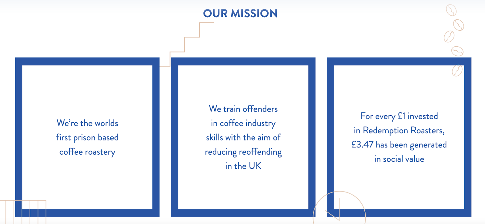
Redemption Roasters is the world’s first prison-based coffee roastery, and they’re on a mission to reduce reoffending rates as they provide convicts with opportunities and training through coffee.
Here’s how it works: they operate a roastery and a cafe for visitors at Aylesbury Prison in the UK and train prisoners as professional baristas. Upon the release of ex-offenders, Redemption Roasters helps them get reintegrated into society by getting them jobs in their 9 cafe branches across the country.
Here’s what we love about their website:
The fact that they’re offering free nationwide shipping for a minimum order total of 15 pounds is a great promotion already, and its placement on the website would encourage more people to make a purchase.

One major selling point of the company is their mission and story, and the fact that they’re highlighting it on their website means they know it. Remember: customers love supporting brands that are socially responsible.
Each image redirects to a pinned location and complete address, which is perfect for those who want to drop by.


Founded by Emma Chamberlain, an American Youtube and internet personality, Chamberlain Coffee is all about sustainability, not just in its packaging but also in its sourcing. So, they work with Food4Farmers to ensure long-term food security for coffee farmers and try to be as environmentally friendly as possible.
And they don’t just sell coffee. They also have mason jars, straws, french presses, and everything else you may need to relish in the coffee experience.
Of course, everything is as full of personality as their founder:
This is great for ensuring that customers are able to get a customised experience. Some online shoppers prefer staying in the US website just because, but the “lower shipping rates” is sure to entice them to choose their correct location.

This would definitely speak to millennials and Gen Z audiences, and it would entice them to check out the different drinks available.

I love that this comes with the header “you are what you drink.” Not only is it a witty play on the well-known phrase, but it also helps drive a point to the audience.


Couplet Coffee is known as a Gen Z, queer progressive brand, and although it is just a little over a year old, it has already made a name for itself in the specialty coffee space. They use vibrant colors and avant-garde designs to appeal tot heir demographic, and they are purposely active in community events.
Here’s a look at how it all plays out on their website:
The photo is the first thing you’ll see on their website and it perfectly communicates the personality of the brand. Scroll down a bit, and you immediately see the corresponding headline in its funky fonts, driving the message further.

“Karen” is a very modern term for Gen-Z (and pretty much for anyone these days haha), and its use in this section would be revered by their young market. Through this, they are also able to convey how their speciality coffee can be enjoyed by non-coffee experts.

This makes it accessible for all visitors at all times, and when you press on it, it just leads to an email sign up page to get the discount.


Onyx Coffee Lab stems from Northern Arkansas, but they have certainly made a name for themselves across the globe. The company has won four national titles at the US Coffee Championships over the past decade alone, and they only continue to raise the bar.
The brand’s heart is based upon transparency, and so in their HQ is a cafe and roasting lab, where people could just come up and ask any question about the process. They also get to see how the coffee is bought, sampled, roasted, and served.
It shouldn’t be a surprise then that the website also includes that level of transparency:
You can just choose any country from the drop down menu, and it will show you how much you need to expect in duties and taxes when importing their products.

The way they phrased their message is interesting, and it would make the site visitor think that this isn’t just another coffee brand.

You don’t have to go through each header one by one to find what you’re looking for. You can see everything at a glance, and this would help customers navigate through.

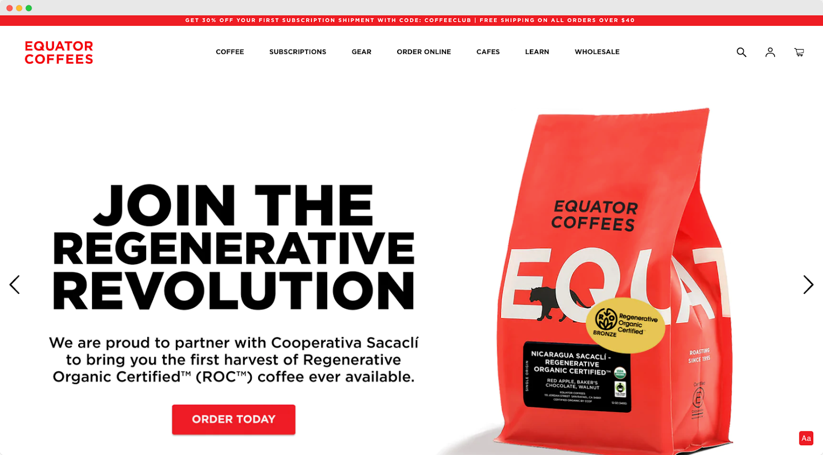
Equator Coffees is a queer, woman-founded, LGBTQA+ business, and it has been in the industry since 1995. The company started out in a garage, and now it is an award-winning brand with 9 branches across America. They import beans from different communities across the globe, but they also run their own coffee farm in Volcan, Panama.
They’re a coffee brand with a greater mission, and their website proves this:
The “Now roasting” tag is catchy, and it’s great that their descriptions fleshes out the nuances of their featured coffee. The carousel also offers their bulk offers and discounts, thereby making their “big rocks” accessible from the get-go.

This is a collaboration exclusive to the brand, and the tagline alone is worth a second look.

This solidifies their brand image and convinces the audience further of their reputation.


The Sister Yard was founded by two Venezuelan sisters in Miami, before they eventually moved to New York. Yami and Cristina Correa handbrew each batch of coffee, but they stick to the recipe they have come to perfect over the years, which involves - you wouldn’t guess it - coconut water.
Here’s how the website props up their brand:
This lets the audience know that they’re in for, and they are able to see the main benefits of the product at a glance.

Coconut-based coffee may scare off the traditional coffee drinker, so this would help them navigate the different ways they can drink this particular brand.

Because social proof works, especially for unique product offerings such as this one.


Coffee and Check is a UK-based coffee supplier that believes there is a coffee flavour out there for everyone. Their focus is on the taste of their product, and they make sure this is communicated and experience on all levels of the customer journey. Their website is then designed accordingly:
Customers can then visit the shop immediately and look at their own pace, or they can first take a test to find out the blend that would work best for them. Providing them with such options will make them feel like they’re in charge of their buying process.

They didn’t crowd the main webpage; instead, they let visitors choose what they wanted to see and know. This would lead to different landing pages, thereby increasing website traffic and opportunities for conversion.

Less words, more action.


Mud Wtr is a pretty interesting brand name, and its overall favour profile is also unusual. The company sells coffee alternatives in powder and liquid form, hence the name. It uses a blend of tea, mushroom, nutmeg, ginger, cinnamon, and a bunch of other ingredients and adaptogens, and each serving has one-seventh of the caffeine in a cup of coffee.
The way they laid out their website is just as interesting:
We have a catchy tagline, a product description, a discount offer, a call to action button, and even a testimonial! To the right is a video of a man preparing the coffee. Even if the visitor never scrolls down, he basically has everything he needs to now from the very start.

This is a unique product, so this would help the consumer feel more reassured, as it includes even the certifications.

This again includes a catchy tagline that would make people curious, so they are more likely to click on the redirect link.


Clevr Blends started as an adaptogenic pop-up coffee bar, then Meghan Markle invested in it. The company grew, and 5 years later, it’s now on Oprah’s list of favourite things – for a good reason. The celebrity seal of approval comes as the company came out with plant-based, healthy coffee latte alternatives that are tasty, creamy, and easy to make. They are also female-led, socially responsible, and sustainable. What’s not to love?
Even their website is great:
This immediately helps visitors know what makes it special, and the shop now button works great if they want to immediately check the products out themselves.

This would help audiences gain more of an affinity with the business, especially as it highlights their diversity, social responsibility, and guarantee.

It’s a simple sentence, but it helps build a deeper connection with the market and would eventually help increase their brand loyalty.


One of my absolute favourite coffee beans that I consume as part of my regular daily latte intake is Campos. They’ve been around for along time now (In fact it's been over 20 years) and is one of the most recognised names you will find here in Australia.
They were originally founded in Newtown which is a super awesome place here in Sydney (for those from here totally know what I mean).
What I love about their site:
The image is superb which highlights the range of products they sell. The layout is a good takeaway and a good learning for any local cafe owners who have a store and want to build an eCommerce site. You can easily see more products by clicking the “Buy Now” button, or find a cafe that stocks Campos (kind of a stockists page you see many sites do).

They look super clean and really make the actual ‘blends stand out on the site. Great use of labelling as well such as “Best Seller” and “Perfect gift idea”.

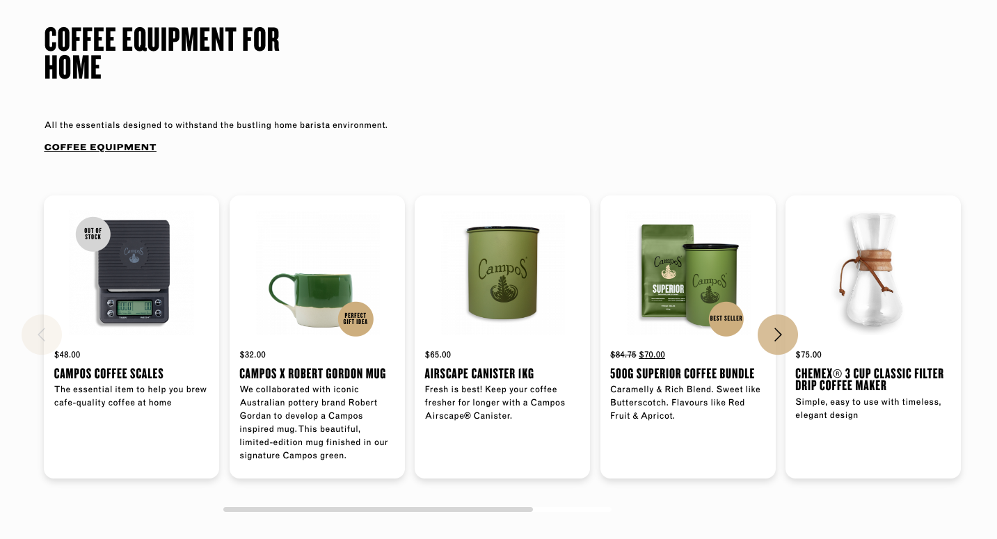
Great layout, explains all the relevant information and the checkout process is slick.


Ignite I only came across recently and love what they’re doing in regards to subscriptions and gift ideas. Whilst I only have discovered them recently, they’ve actually been around for over 30 years in the best city in the world… you guessed it, Sydney.
They have a great mission around sustainability and also support local charities with donating 10% of their profits to causes. Absolutely awesome to see these guys supporting great causes.
They also have a great blog worth checking out.
The goal here is to increase AOV and try to encourage repeat purchases. I also like they have the embedded reviews which you can see on desktop before you scroll down. A small psychological trigger to highlight to visitors that their a legitimate business that people love.

Builds trust and shows they do care about their local community, which is something many people value.

The reality is most visitors wouldn’t necessarily sign up to their newsletter, yet they most likely would follow their IG account for the giveaways. Who doesn’t love competitions, right? Good way as well to remind people to tag and share their experience with the products.
I’ve shared many of my favourites I’ve come across (and have personally bought from), but there are three standouts for me that anyone reading this guide should check out. They are Drink Okana, The Good Ritual and Couplet Coffee. All of them have amazing aesthetic imagery and designs, but more importantly, they all have a great UX, layout, social proof and CRO-trigger tactics implemented across their site.
If you’re wanting to create one of the best coffee shop websites, it all comes down to first planning the design, what you actually want to sell, and most importantly, what goal and expectations do you have for this part of your business. I believe one of the best things you can do is by starting off small, and adding incremental changes and improvements over time as you grow. I say this because I have found many times that people starting out love to do everything at once, but then what I’ve found is that it ends up blowing costs that you could have spent on more important initiatives such as advertising and social media content. There are many website builders you can use, and most have free themes you can choose from and host for a cheap monthly fee. Do this before adding anything complex. The goal when starting is to see if people buy your products before investing more.
This is a good question because I have found people get caught up with trying to perfect the design of a website but neglect conversion-focused design. For anyone starting out for the first time building a website, you can definitely aim to have a sleek look, but I always recommend to go for a minimal design over any sort of fancy animations. I’ve often found that just by having a clean layout, with a white background, a beautiful hero header image (or nice video background), with a simple area for essential information, with then of course, highlighting your coffee products goes a long way when it comes to giving a great first impression. A simple and easy experience helps the visitor focus on what’s more important, which is your coffee products. So whilst the creative design is important, always choose simplicity over investing in something fancy.
It can be overwhelming when it comes to choosing a page builder, but there are three standouts I always recommend to new people starting out with eCommerce or is their first time building a website. Look into Squarespace, Shopify or Wix. Each of them has a friendly user experience, an intuitive drag and drop builder, a great supporting community, and beautiful templates you can choose from. They are also cost-effective solutions, so they won’t break your bank account.
It’s important in my eyes to keep things simple on your homepage as well as across your collection, product pages, and your checkout. As a baseline on the homepage, you should aim to have a nice video highlighting your products, key selling points, social proof (such as reviews, and testimonials), images/photos from your social media profiles (e.g. Instagram feed), and a display of your products. As for the other pages, if you decide to get a template and pick a good CMS such as Squarespace or Shopify, they should the key necessities ready to go for you. Then, modify further over time as you wish. Remember, keep things minimal rather than doing any complex animations or design.